A New Integrate, Part 1: User Interface Refresh

When we first started building Integrate, our visual identity came together quickly. We were moving extremely fast and needed our brand—and the app we were building—to stand out to our earliest users. Simple as that. We chose colors that were distinct and vibrant: purples, magentas, oranges, and teal—and painted the user interface with them liberally. For a long time, they served us incredibly well. Our unique palette gave Integrate a distinct feeling and helped us stand out in a sea of generic project management “solutions.”

(👆 Integrate circa 2022)
As fall sets in in 2025, we find ourselves in a new phase of growth. Looking back, we’ve added tremendous complexity and more discriminating features to the app than we can count, and what was once playful has become distracting and childlike. Looking ahead, as our adoption grows, we know that what were once learnable quirks in our color scheme will continue to compound and eventually slow down the average user.
It's clear that it's time for a change. We're excited to announce that we'll be rolling out a phased redesign of the core Integrate app over the next few weeks.
1️⃣ This release is Part 1 of 3 of that transition.
What's Changing and Why
This redesign is not just a fresh coat of paint. It's about making Integrate more intuitive, accessible, and powerful. We’ve been listening to feedback from our customers and this effort is a direct response to what they've told us.
The goal is to align with forward-looking software design conventions, reduce visual noise, and give you more control over how you organize your work. We're rethinking how we use color across the app to make it easier for you to understand things at a glance.
The first phase of the rollout focuses on colors and typography. This is the foundation for all the changes to come. You'll notice new fonts that are easier to read, slightly more compact (for our engineer power users out there. We see you!) and more versatile (see: new paired monospace type style). You'll also immediately notice a refreshed color palette that's more consistent and accessible. We've chosen warm light tones for the app surface so that when color is used to indicate something intentionally, it stands out more so. This palette also sets us up to more easily add an eventual dark mode!
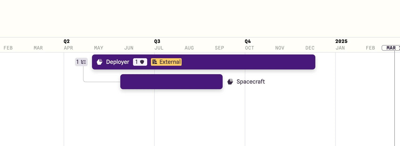
Most notably, we're changing how you see external items that have been shared with you. We've heard from many of you that things like the green bars in the Gantt chart can be hard to see, and that distinguishing between internal and external items by color alone can be confusing, and hard to learn—especially for users with color-blindness.
Before: Items visible to people external to your org appeared with green markings throughout the app, relying on color alone to differentiate them.
Now: External items will be marked with a more universal yellow “External” label. This change aligns with common industry conventions (yellow = warning) and improves accessibility by pairing color with clear text and an icon.
Additionally, we're moving away from trying to color-code "internal" items at all, because what really matters is flagging what’s external—that's the key information you need to be aware of.
What's Next
This initial phase is just the beginning. The next phase of our rollout will be a continuous release, with many new major and minor changes and improvements launching every week. We'll be sure to update our release notes with each new change, providing context and documentation for you as we go. Our goal is to make Integrate a more powerful and effortless tool for our users, and we believe this redesign is a critical step in that journey.
Stay tuned for Part 2️⃣ of these updates as we roll out these changes over the coming weeks! We're always improving, so please share your feedback with us along the way.
Andrew Sloan
VP of Product & Co-Founder